Ame Cha
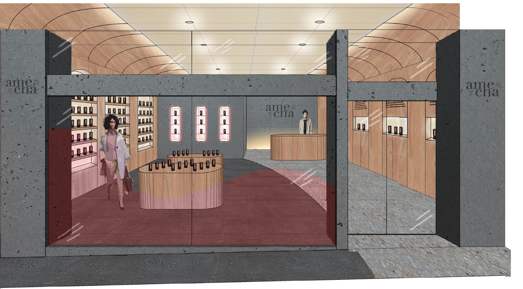
The task was not only to create a brand and packaging but also to design the store inside and front. A unique opportunity to explore interior design and architecture and how that plays a part in brand and identity design.
The brand name is from the Japanese words 雨 (ame) meaning rain and 茶 (cha) meaning tea. Two single-syllable words that help to communicate the feeling of the brand, calming, peaceful and relaxing.
—
completed at QUT in 2021


The beige brown tones symbolize warmth, enclosure and a cozy feeling that helps to bring to light the aim of brand, providing comfort through the products and space.

The dusty rose tones connect the brand to self love, meditative & ritualistic state, mindfulness, aromatic and perhaps a self indulgence feeling. The dusty rose tones are used exclusively on all physical product based items.

The blue grey tones are used to facilitate a sense of foundation and security. It is a simple calming trustworthy colour that helps to ground the feeling of the brand.

The beige-brown tones are used in the Tasmanian oak timber veneer display tables, Point of sale desk and coved ceiling. Warm beige is also incorporated into the display shelving in the form of back-lit marblo that illuminates the products sitting on the shelves. These monochromatic colours provide warmth, enclosure and a cozy feeling that provides comfort through the products and space.
The dusty rose tones connect the brand to self-love, meditative & ritualistic state, mindfulness, aromatic and perhaps a self-indulgence feeling. It is used on the packaging of the product, the feature display shelving and the storefront window. Every application has a direct link back to the physical product.
The blue-grey tones are used in the materials; concrete with exposed Aggregate, Timber Look Glazed Porcelain Tile & rendered concrete to facilitate a sense of foundation and security. Using this calming trustworthy colour helps to ground the feeling of the store which is why it is used for flooring, far back walls and entry pillars.

The packing used is simple long glass jar that shows of the beauty of the tea leaves. This way the customer can see inside and clearly be able to differentiate the teas while taking in the vast beauty of the varying leaves, ‘its whats inside that counts.”
